How hey.com Looks on Facebook
hey.com has the basics in place, with a handful of fixes that would tighten things up. Open Graph, Twitter Card, and a favicon are all wired up. The previews below show exactly how a link to hey.com looks on Facebook.
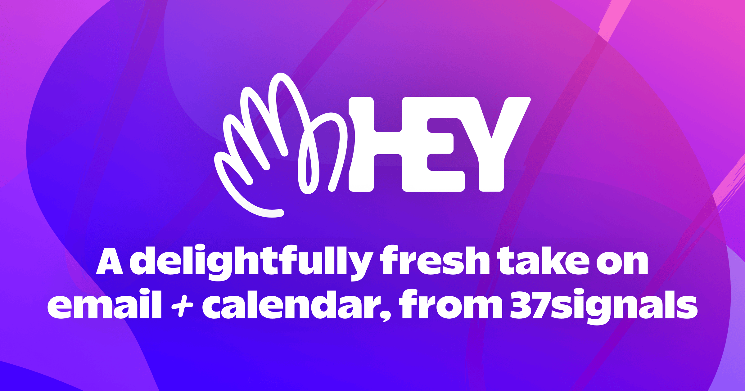
Facebook preview
Large card (image ≥ 600px wide)
www.hey.com
A delightfully fresh take on email + calendar, from 37signals
Gmail, Outlook, and Apple got complacent and took their eye off the ball. Then along came HEY.
Compact card (image < 600px wide)
www.hey.com
A delightfully fresh take on email + calendar, fro...
Gmail, Outlook, and Apple got complacent and took their eye off the ball. Then a...
Frequently Asked Questions
og:type as website. This tells Facebook how to categorize the content when generating a preview.See hey.com on other platforms
Same domain, different platform-specific report.
Validate other sites on Facebook
A handful of other domains scored on the same platform.
Validate your own URL
See how your site looks across all major social platforms - instantly, free, no signup.
Try LinkPreview.io